
OxiWear · 2026 · Senior UX/Product Designer
OxiWear Clinical Report Portal
A restructure of the portal used to generate FDA-regulated medical records. On this surface, a confusing interface isn't just friction — a misconfigured report can put outdated vitals in front of a clinician.
The work below splits into two kinds of issue, found and fixed differently: problems, friction that never touched clinical data, and hazards, a plausible path to a clinician acting on wrong or missing data under ISO 14971 / IEC 62366-1.
01Overview
- 3 problems solved — the IA and terminology restructure, the Verify Data check, and the vitals selection
- 6 hazards controlled under ISO 14971 — 3 found through real incidents, 3 designed out from the start
- The Figma-and-Notion design system behind them
OxiWear's Clinical Report Portal is the web application care specialists use to monitor home-based device users wearing OxiWear's FDA-regulated ear-worn pulse oximeter, and to generate the clinical reports (General, Sleep, 6MWT) that go into a patient's medical record. It spans two surfaces: a fitness dashboard for lower-stakes personal tracking, and the medical dashboard this case study focuses on.
Three threads ran through the work: solving usability problems through an IA restructure, controlling six clinical-safety hazards under ISO 14971, and formalizing those hazard controls into a Figma-and-Notion design system now used by design and engineering beyond this project.
The guiding principle throughout: safety and reliability first, ease of use second, aesthetics last. Every trade-off in this case study — which UI pattern shipped, which control got added — was decided by that ordering, not the reverse. The side panel that shipped for vital selection isn't the visually tidier option — a dropdown was — but it preserved full data resolution. The Verify Data check isn't a flashy feature — it exists because a wrong report is worse than an ugly form.
02Design process
Sort every issue into problem or hazard first, before designing anything.
For a hazard, trace the chain: use error → hazardous situation → harm → control. (.)
Check the design system before inventing a new fix. Most of the hazards below already had a control — the job was recognizing it applied here.
Check whether the fix itself introduces a new hazard. The auto-save/restore control below is the clearest example: its first version created a new risk, caught before shipping.
Validate at the right level — problems against the people who reported them, hazards against the design-system baseline they came from.
03Key decision: staging the rollout around regulatory risk
OxiWear's portal spans two surfaces: a fitness dashboard and a medical dashboard used for clinical reporting. The medical side carries real regulatory weight — a client complaint there gets formally logged and can trigger a compliance review. So I proposed piloting the redesign on the fitness dashboard first — lower stakes, faster feedback — before extending it to the medical dashboard, which adds the Sleep and 6MWT report types.
Problems
Usability friction with no plausible path to clinical harm — it costs time or a support ticket, but no incorrect, missing, or delayed clinical data ever reaches a clinician. Fixed through IA and terminology redesign.
Hazards
A plausible path from a use error to a care specialist acting on wrong, missing, or delayed clinical data, under ISO 14971:2019 / IEC 62366-1. Fixed through hazard-specific controls.
04Problems & fixes
Validated with the people who reported them
Two ways to select vitals
V1 of the reporting flow was rigid: reports defaulted to just SpO₂ and pulse rate, capped at a hard ten-minute window of raw, one-second-resolution data. As we expanded the flow to let clinicians build custom multi-vital reports, I hit a decision point with my Head of Product at report-configuration step two: keep the portal's established grouped-dropdown pattern for selecting vitals, or adopt a side panel — every vital as a checkbox, with live min/avg/max previews.
My first instinct
I initially resisted the side panel — its own width would eat further into an already tight ten-minute window. But the design principle forced a sharper question than which one looked better: was this step a diagnosis stage or a setup stage?
The question that settled it
It's setup — an administrative step where the chart is a sanity check, confirming which streams are active and roughly what they look like, not something a clinician is diagnosing off of. Shrinking that preview cost nothing in safety. With safety off the table, ease of use won: for someone toggling through dozens of raw physiological streams, the side panel's multi-select and live summaries were a clear improvement over reopening a dropdown for every vital.
The bigger ceiling
That still left the real ceiling unsolved — a hard ten-minute cap on the data itself. Rather than accept it as fixed, I worked with engineering to remove it: the side panel is strictly a step-two setup tool and disappears once the report generates, and the final report viewer no longer compresses data into a fixed window at all — it expands horizontally as a scrollable timeline, preserving full one-second resolution no matter how many vitals or hours a clinician selects.
Where the trade-off still shows up
That full resolution doesn't carry over to a printed report, though — paper can't scroll. A print shows the overall trend rather than every data point past a certain range. That's an accepted limitation of the static medium, not a gap in the interactive design.
The pattern behind the escalations
A specialist would select a time range — an afternoon window, say — expecting it fully populated with one-second data, and the generated report would come back with noticeably fewer points than expected, or visible gaps in the line graph. Real device gaps cause this: the device wasn't worn continuously, or a Bluetooth connection dropped. But to the specialist it looked broken, and they'd contact Customer Success, who'd loop in engineering to check the backend — confirm the device user, confirm the timeframe — before concluding it really was just a gap in wear time. That round-trip cost time for the specialist, CS, and engineering, every time it happened.
A modal with its own problems
The modal it happened in had its own separate problems. It was a blocking popup — a specialist couldn't step away mid-task and come back to where they left off — and content-heavy interactions, editing the graph especially, ran into real technical constraints trying to fit inside it. A full-page split layout replaced it: room enough for that interaction itself, and room enough to add a real diagnostic step alongside it.
Where the first fix fell short
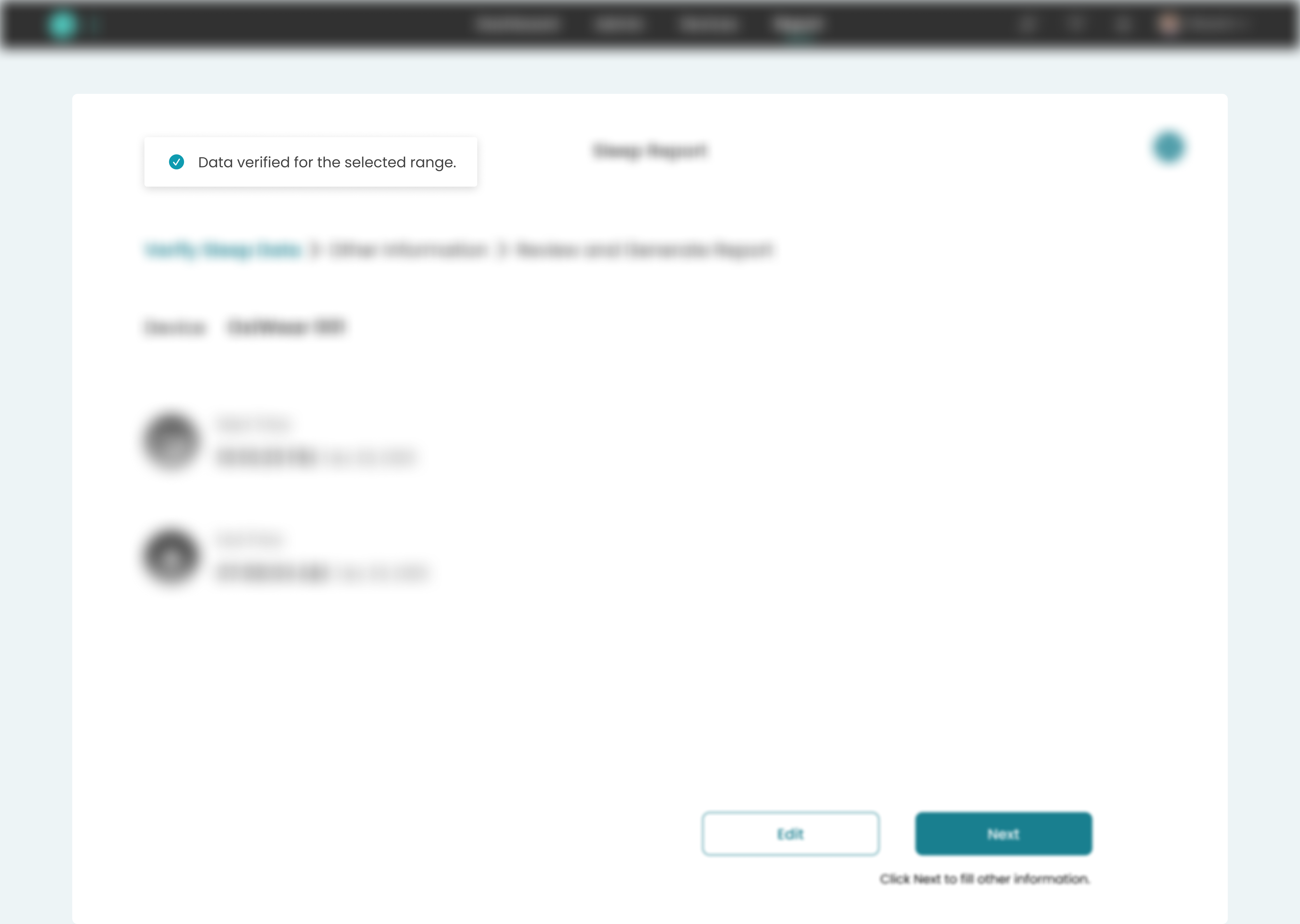
The first version of that diagnostic step verified against a low bar: if a single valid data point existed anywhere in the selected range, it passed. That caught the worst case — a genuinely empty range — but not the more common one: a range that was mostly gaps, verified successfully, and then generated a report with far less data than the specialist expected.
Showing the real coverage
The version that shipped replaced pass/fail with the actual data-point count per reading type, shown before configuration opens — so a specialist can see real coverage for themselves, and tell a legitimate gap from a configuration mistake, without escalating to find out.
Before
After

05Hazards & controls
Validated against a hazard-matrix review
Step 1
Use error
Step 2
Hazardous situation
Step 3
Harm
Step 4
Control
Every control gets run back through this same chain — checked for a new use error, hazard, or hazardous situation of its own.
A hazard is different from a problem: there's a plausible path from a use error to a hazardous situation to actual clinical harm, formally assessed through a hazard matrix — severity plotted against probability, scored against a threshold that decides whether a control is required. (See for the full chain and how that scoring works.)
All six were already working as fixes on the fitness dashboard before this project — three found through a real incident, three designed out from the start — but only as one-off screen decisions. I turned them into a documented Figma library and Notion reference, drawing on FDA design-control experience from earlier projects, then confirmed each still held up in medical's higher-stakes context. That library is now what design and engineering both reference for these patterns.
Found through a real incident
The original hazard
A care specialist creating a report would get pulled away by a live-monitoring alert on another client — meaning a choice between finishing the report or losing everything entered.
First fix — and the hazard it introduced
A saved-draft pattern was the obvious fix, but a full report takes one to three minutes; re-verifying a draft could take longer than restarting. So the report instead restored the specialist's exact state on return — but that fix introduced its own hazard: restoring directly into step two meant losing the visual confirmation of which device user was even being configured for, risking a report generated for the wrong patient.
Corrected control
Returning from an interruption always lands back on step one first — the confirmed device user — before the specialist clicks through to step two, where everything already entered is preserved.
A clinician on the East Coast needed a report for a patient in San Francisco, converted the date range to his own timezone before entering it, and pulled the wrong window — the system had been displaying the device's local time all along, not his.
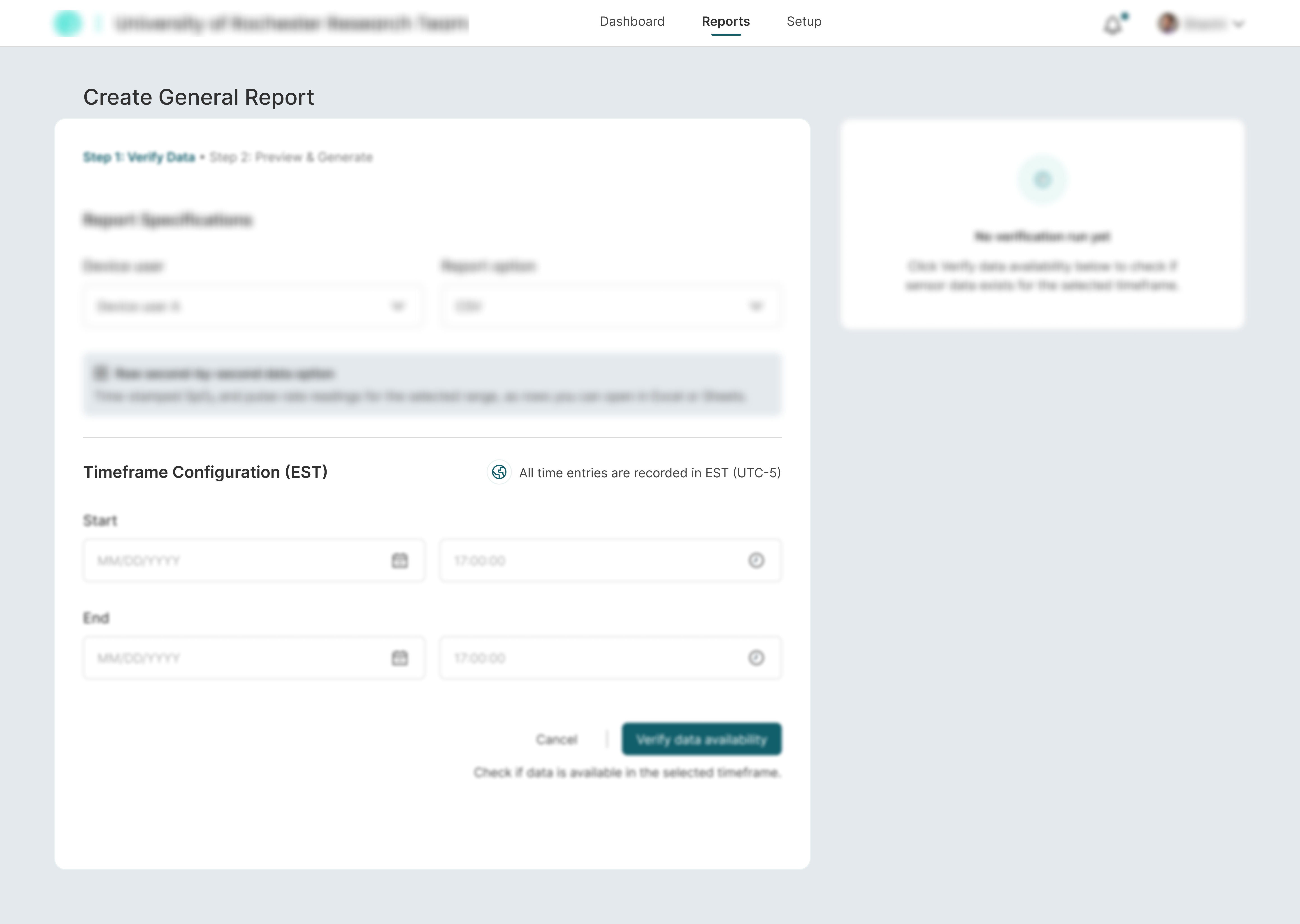
Control: timestamps are always labeled with the device's own timezone (e.g., “14:32:05 PST”) — nothing to convert.
A clinician printed a report and said two vitals' lines looked identical. The colours had already passed WCAG contrast and a colourblind-safe palette test — but a monochrome printout strips hue entirely and keeps only luminance, so two colourblind-distinguishable colours can still collapse into the same grey.
Control: pattern and node shape are the primary differentiator, not colour, with an always-visible legend.
Designed out from the start — no incident behind these
- Lost reports with no system record→ Retained report history
- Alarm fatigue from decorative red/amber→ Red/amber reserved for abnormal vitals only
- Accidental medical record deletion→ Multi-step dialogs requiring value matching
All six, at a glance
Hazard
Control
Remote clinicians converting to their own timezone.
Timestamps always show the device’s own timezone.
Colours collapsing to the same grey on a monochrome printout.
Pattern + shape as primary differentiator; always-visible legend.
A live-monitoring emergency forces a choice mid-report.
State restores via the device-user confirmation step first.
Lost reports with no system record.
Retained report history.
Alarm fatigue from decorative red/amber.
Red/amber reserved for abnormal vitals only.
Accidental medical record deletion.
Multi-step dialogs requiring value matching.
06The design system
Why a system, not just screens: the same low-level questions — how to show a number that updates, a timestamp, a two-line chart so it can't mislead a care specialist — kept coming back on a regulated product. I answered them once, in a written spec the whole web product now builds against: the FDA-Regulated Design System & Clinical UX Guidelines. It's the mobile app's already-validated human-factors work translated into web components.
What makes it defensible on a regulated product: every rule names the hazard it prevents, so any component traces back to a specific risk — the six hazards mapped above.
Numbers
Tabular figures on every live value; slashed zero on device IDs
Prevents: a shifting column, or an O / 0 mix-up, causing a misread
Time
Absolute 24-hour time with a zone (14:32:05 EST) — never “5 min ago”
Prevents: a relative timestamp misread on a cross-shift handover
Colour
Red and amber only on abnormal vitals; teal is the one interactive colour
Prevents: alarm fatigue — a real warning lost among decorative colour
Charts
Series told apart by pattern + node shape, not colour; legend always visible
Prevents: two vitals collapsing into one on a black-and-white printout
Destructive actions
Multi-step dialog with value matching, not a plain “Confirm”
Prevents: an irreversible medical record deleted by a mis-tap
Alerts & offline
Three-tier alert priority; a persistent offline indicator with sync status
Prevents: a low notice reading as urgent, or stale data read as live
Icon buttons
0 ms action-verb tooltip, 44 × 44 px hit area, matching ARIA label
Prevents: a mystery-meat icon, or a hurried tap hitting the wrong action
From the Figma library
The rules ship as real styles and tokens. The type scale forces tabular figures on every vital and a slashed zero on device IDs; the colour system keeps red and amber off the interface chrome and reserves them for clinical state.


Charts, built for monochrome
Reports get printed in black and white. Pattern and node shape — not colour — keep two series apart, and the legend never hides.
Desaturate it and it stays completely readable — that's the test.
07Validation
Problems
Walked the redesigned flows with Clinical, CS, and Sales — the same groups whose questions surfaced the issue. Fitness pilot as a live check before medical.
Hazards
Already validated once on fitness. This project confirmed correct implementation on medical's higher-stakes Sleep/6MWT reports. A full summative HF study is the next step.
08Impact
Org and process: the six hazard controls are now a documented Figma library and Notion reference that design and engineering both pull from, beyond this project — built with real cross-functional buy-in from Head of Product, Clinical, Sales, CS, and Engineering on a surface where a misstep gets formally logged.
Product: launched on fitness first — user-reported issues dropped noticeably during that pilot, and Sales and CS reported fewer recurring questions about the flows that had prompted the work. That justified extending the model, plus the hazard controls for Sleep and 6MWT, to the medical dashboard.
Business: the medical dashboard, carrying these controls, is now piloting with prospective hospital clients — a new, higher-stakes client segment for that surface.
Still missing: hard usage metrics and a dedicated summative human-factors study for these Sleep and 6MWT reports specifically are still pending.
09Appendix: the risk framework
Following ISO 14971:2019, every issue traces through a chain. A use error — an action, or missed action, producing an unintended result — creates exposure to a hazard, a potential source of harm. That can become a hazardous situation: someone is actually exposed to it. If it plays out, that results in harm. A control is designed to break that chain — removing the use error, closing off the exposure, or stopping the hazardous situation from turning into harm.
Risk is severity combined with probability — and probability splits into how likely the hazardous situation is to occur, and how likely it is to then cause harm. Severity runs from negligible to catastrophic; a use error scoring at the top is a “critical task.” Whether a hazard needs a new control isn't severity alone — it's weighed against a threshold, but unevenly: high severity usually calls for a control even at low probability, since the consequence is too serious to leave to chance; low severity often doesn't, even at moderate probability, since the worst case is just an inconvenience.
A control isn't finished once it breaks the chain it was built for — it has to be run back through that same chain, checking whether the control itself introduces a new use error, a new hazard, or a new hazardous situation. The interruption-recovery control is a direct example: the original fix broke the chain it targeted (losing report progress on interruption), but retracing the fixed design through the chain again surfaced a new one — restoring straight into step two skipped the device-user confirmation, opening a new use-error path to configuring against the wrong patient. The final control closes that second chain too, always landing back on step one first before the specialist can proceed.